


期末写货币银行学的论文,要研究利率对房价的影响,需要作一堆图来对比国内外情况,选择了用R绘图(Excel明明半分钟就可以了,我用R写了一个小时TAT),效果如下:

代码如下:
FUN <- function(){
  # 绘制房屋价格指数
  plot(x = JP$Year, y = JP$Price,
  xlim = c(1970, 2015), ylim = c(20, 120),
  pch=16, axes=FALSE, xlab="", ylab="", col="blue", type="b",
  main = "House Price Index & Interest Rate in Japan from 1970 to 2015")
  # 左侧坐标轴
  axis(2, ylim = c(20, 120), col="black", las=1)
  # 图示标签
  text(1975, 28, labels = "House Price Index", col = "blue")
  # 左侧坐标轴标签,注意line参数调整位置
  mtext("House Price Index (2010=100)", side=2, line=2.5)
  # 允许在同一张图上画第二条折现
  par(new=TRUE)
  plot(x = JP$Year, y = JP$Interest,
  xlim = c(1970, 2015), ylim = c(0, 10),
  pch=16, axes=FALSE, xlab="", ylab="", col="red", type="b",
  main = "House Price Index & Interest Rate in Japan from 1970 to 2015")
  axis(4, at = c(0, 2, 4, 6, 8, 10), col="black", las=1)
  mtext("Interest Rate %)", side=4, line=1.3)
  text(1974, 7, labels = "Interest Rate", col = "red")
  # x轴标签
  axis(1, at = c(1970, 1975, 1980, 1985, 1990, 1995, 2000, 2005, 2010, 2015), col="black", las=2)
}
# 储存为svg(我这么认真画的图,导出为png品质那么低,强迫症不满意:P )
svg(filename="test.svg",
width=12,
height=8,
pointsize=12)
FUN()
dev.off()
事实上这类简单图像用 STATA 画的话会简单且美观很多:
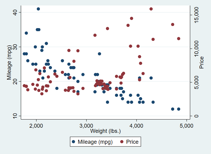
sysuse auto, clear
scatter mpg weight || scatter price weight, yaxis(2)
「樱花庄的白猫」原创文章:《R语言中plot函数的双坐标输出》,转载请保留出处!http://2heng.xin/2017/05/25/plot/
Q.E.D.


Comments | 1 条评论
牛逼!